Hybrid Heroes | Alter Egos

|
Title: My Green Filled Dream
Medium: Cardboard and Glue Date: March 2021 Exhibition Text: My Green Filled Dream is a sample of what happens within my head specifically in my dreams. Here I combined two dreams that were in similar style of houses, giving a calm state of things but the story behind them are something else. this was made mainly in geometric shapes aside from the top that was made it organic shapes. |
Inspiration
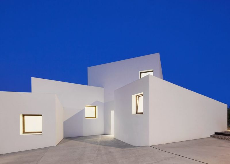
The MM House by OHLAB
|
When looking into houses that looked similar to what I had seen in my dreams, Oliver Hernaiz Architecture Lab (OHLAB)'s MM House was the first that was the closest to what I had dreamed about. The cubed look it has was exact but the only difference was the spacing between them. Looking more into OHLAB's work, I was very interested in their sketches and plans of buildings that seem simple, modern, and overall something I hope to be part or use as inspiration for personal projects. |
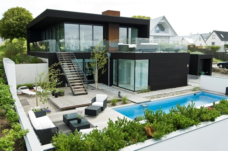
Villa Nilsson by John Robert Nilsson
|
Now looking into other modern houses that would be similar to one that I had once seen in a dream, Villa Nilsson by Robert Nilsson was the one. The main focus on this one was just the house, minus the pool and lounge area outside next to the pool. The building itself is interesting to me from the balcony, wide windows and minimal details. |
|
The structure of the project itself is not related to any architectural form of art, but instead inspired by Edgar Degas' works of ballerinas and resemblance to stadium vendors. As shown in the final product image, the main ring that is around my waist is similar to a ballerina's tutu just like in Edgar Degas' The Star but the waterfall suspenders and top clouds are more similar to a stadium vendors outfit where he holds the cups. When planning to make the rings I already had in mind the rings to be similar to a ballerina but the waterfalls overall reminded me more of a stadium vendors. |
|
Planning

|

|
|
The first sketch has the measurements I either used or was planning to use. For example the one labeled "Bottom Widest", I was trying to figure out the easiest way to put on the bottom ring without having to make a slit that could bend and I slide it on. So then the chest measurements were smaller so it helped knowing to wear the ring first putting it over the head. A minor mistake was remembering to measure not only the chest, but also the arms so I could put it on.
|
The second sketch shows the outline for the other main building and how it is suppose to look like from different angles. I split it into two for each level. At the bottom of the page of the sketches are the measurements I used for the houses, both the small white ones and big, black, modern house.
|
Process
|
|
I first started with the bigger ring of the two I was going to do. Since I didn't have a huge, singular piece of cardboard, I used a box and cut the sides into rectangles from the sides they were already folded. With two of the rectangles I laid them out next to each other from the short sides and then with the measurements of myself shown in the planning section, I found the radius of it with some simple math. Then I placed another two rectangles to make it into a plus sign since the circle I would be cutting out would be cut off and the rectangles wouldn't connect unless there were another two top and bottom. After that, I glued them together by leaving a bit of the "1A9" and the one with five rectangles with some space that would go under the other original two rectangles. After connecting those, I connected another four but in the spaces left between the cardboard. Those would then be glued under the second layer of cardboard so it looks like it layered downwards and not all just plain. Now showing up on the slides is a sample of cardboard with strips of green cardboard on top with the tips cut pointy. I had tested out on leftover cardboard how layered green cardboard looks like for grass and I liked it so I used it like that on the third layer of cardboard, also thought of as the corners.
|
|
|
Next up with the images shown to the left, the cubed houses were the next thing I made but there were mistakes at first and some changes. Since I wanted them to look like white cubes but my white colored cardboard was very thin, I knew it wouldn’t hold up together as it should. So instead I used another cardboard I knew I wasn’t going to use for color and more like a base. I cut up a big box and used one of the sides and cut it up into equal squares that would be cut together to make the cubes. The original plan was to put the white cardboard over the cube as wrapping paper, but two sides wouldn’t be covered and then I would use small pieces and cover those sides up as if they were puzzle pieces, which overall didn’t look as good as I wanted it to. So I tried again but this time just cutting the white cardboard up into squares and gluing them like that, which came out better and gave it a more minimized look.
|
|
From the images above and to the right, it is the cubed houses that I would put onto the ring and have a similar view as the second sketch I have where it's white and green squares. I had make a mistake as to how to add the white layer on top so then I scratched that off and decided to give it a more simple look to it and have the surrounding that would be added later to have more detail. There was spaces in between the squares to give it a more checkered look to it from the top so I laid them out to see how it would look like. |

|
|
The other main building I was going to make was the modern house. I did it similar to the cubed houses, by making a base with random cardboard and then layering on top the black thin cardboard. I split it into the amount of floors, so I did the bottom first that was going to be one square longer than the top floor. After making the base for the bottom, I proceeded to make the top one and then glued them together. When looking at the inspiration, I realized I needed to make the windows too. Since I had some leftover thin white cardboard, I used those pieces to make the windows. I didn’t need to be as precise with the white area because it would be layered over the black sections that will make the frames for the walls with the windows. The walls that didn’t have windows, I used the same method as for the cubed houses, by only cutting the pieces as one piece, one wall.
|
|

|
After gluing the grass for the edges, the cubed houses on one side and the black modern house on the other side, I had also laid out green strips of cardboard onto the area the houses were but also left four corners empty and one area empty to put blue over it. The strips were geometric shapes but the little lake by the black house was an organic shape filled with geometric ones. |
|
|
The smaller ring was easier to make, and the idea was to make clouds around it to make it look like my head was in the clouds. It would make something metaphorical, literal. I made four clouds, two big and two small for the back. After making those clouds and making small bends to all of it, I would use the back of the cloud that isn’t shown to glue the waterfalls from there to the corners that were left empty on the bigger ring. For the waterfalls, I used two different blue card board and cut them into two long strips for each waterfall. |
Compare and Contrast
|
Image One
-Color is different, Degas has white, mine has vibrant greens and blues -The material is visually different and also mine is geometric compared to the ruffled tutu Image Two -Layout of the building is different because one is separate and the other is meshed together. Image Three -The inspiration is more detailed and the actual one is minimized |
Image One
-Shape is similar as semi flat rings and ballerina pose Image Two -Consists of the same shapes and color Image Three -Same structure |
Reflection
This is something I don't do as much because it is more of making a structure and I have done mainly drawing or anything on a flat surface. Doing a project that is more than just from one dimension was a challenge I was excited to face. I enjoyed trying the different ways to make the project look one way or another. My train of thought had gone in many ways but I had decided in doing something more minimized in looks such as a ring like a ballerina’s tutu and something else was the houses where it balanced them out when looking at it with one house being dark and singular and the other side was several small ones in white. If anything, it also helped me see more of modern houses and when looking into the inspirations there were several others that I would be interested in looking more into.
ACT Responses
1. Clearly explain and describe how you are able to identify the cause-effect relationships between your inspiration and its effect upon your artwork.
The small pieces of it such as the houses are mainly mini figures of the inspiration showing a direct connection. With the overall piece, it is less of a direct inspiration but the figure has its similarities.
2. What is the overall approach (point of view) the author (from your research) has regarding the topic of your inspiration?
Both focuses on the houses are based on modern, unique, minimalist designs that were the path I was going for with these.
3. What kind of generalizations and conclusions have you discovered about people, ideas, cultures, etc. while you researched your inspiration?
Contemporary and modern houses have its similarities and personally I would love to see more of them around instead of just places of higher status.
4. What was the central idea or theme around your inspirational research?
The theme was going for something modern, simple, that wouldn't go too in details but it gave a nice look at the end.
5. What kind of inferences (conclusions reached on the basis of evidence and reasoning) did you make while reading your research?
The modern/contemporary houses have a sophisticated aesthetic and pleasing to the eye with the very geometrical design that doesn't involve many triangles. It makes a change and can be seen as something that can differentiate the houses from now verses then.
Bibliography
“All-White Cube Houses.” TrendHunter.com, TREND HUNTER Inc., 19 Sept. 2016, www.trendhunter.com/trends/mm-house.
“The Economics Of Stadium Vendors.” Centives, 27 Sept. 2015, www.centives.net/S/2015/the-economics-of-stadium-vendors/.
“MOST POPULAR PAINTINGS.” The Star, 1878 by Edgar Degas, www.edgar-degas.net/the-star.jsp#prettyPhoto.
Ohlab, Admin. MM HOUSE, 28 July 2016, ohlab.net/en/project/casa-mm-2/.
Unknown. “Modern Beach House With Minimalist Interior Design, Sweden.” World of Architecture, 1 Jan. 1970, www.worldofarchi.com/2013/08/modern-beach-house-with-minimalist.html.
