Painting Based on Photography

|
Figures of the Scene
Canvas, Water Based Oil Paints 12in x 12in November 2020 Figures of the Scene was painted to show an abstract way of Life From a Distance with pastel like colors. It is inspired by Helen Frankenthaler and her abstract work of art in getting the bigger picture without going into every detail in a painting. |
Inspiration- Helen Frankenthaler
|
I had originally planned to use another painter as inspiration, but then I found Helen Frankenthaler. She became an influence to the Color Field school of painting that was created by artists that admired her. She had won many prizes for her paintings from Paris, to representing the United States with her art. She had a variety of medias she worked on but it seemed abstract painting and printmaking were some of her greatest. From her collection of paintings from to 50's to the early 2000's, the ones from the 70's were the ones that caught my eyes the most. Nature Abhors a Vacuum was the one that connected the most with my Figures of the Scene specifically on the colors used on it compared to an area of mine. |
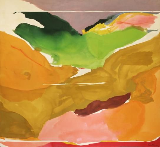
"Nature Abhors a Vacuum" by Helen Frankenthaler, 1973
|
Planning

|

|

|
|
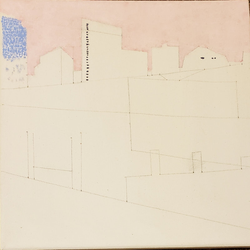
On this planning page, I thought about some shades of the paints I will be using would look like. Some examples are the different pinks thought of to use for the sky, the greens to show shade in some areas for the grass and trees. Others for the right side trees, the blue shades for the buildings, and the teals for the left side trees.
|
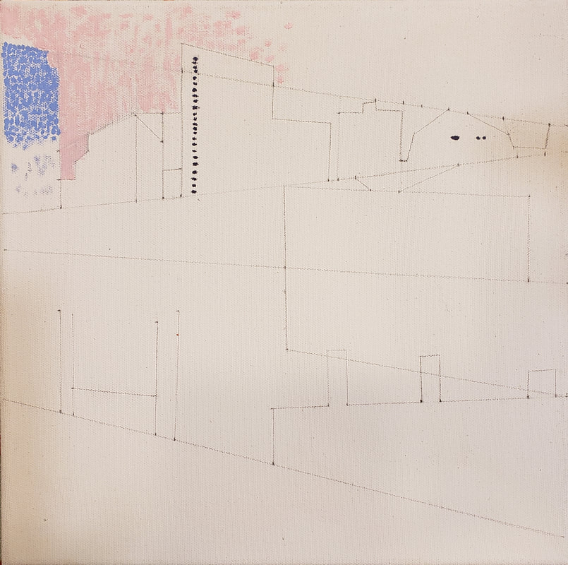
Since the original picture is a rectangle, I cropped it into a square then made a grid of nine squares in order to pick from one of them to paint. After choosing one, I made some base lines to know where everything went, and slowly added more lines to form the main figures and separation of colors. Next I made the measurements to almost all the lines there, to then convert in the size for the canvas
|
Here are some of examples of the measurements going from the paper size to the canvas size so it isn't all wonky or not rationed correctly. The lines of a different color are the base as to where to start and are a guide to know where to paint with a certain color.
|
Process
|
My original plan was to paint this inspired by Claude Monet's style, but seeing the results, I did not. From the second picture in my planning section, I outlined the picture into lines created using my ruler and at first it started with just four basic lines, but as shown to the left, I had gone overboard with details as to where everything was. The base lines that led to all of this was the four main ones for example the top line that goes across the canvas, the long middle line, the line between those two that if connecting them, would make a slightly tilted "Z". The last line is the one all the way at the bottom, and so with all of those I started plotting point and slowly connecting them to make the somewhat geometric version of the photo. I attempted to paint the dots for the sky and starting the building a bit but came back to it later on. |
|
Here on forward, is where I decided to change the artist and went with Helen Frankenthaler. I started using the red and white for a the most part of this time for both the sky and the reflection of the sky in the water. I had different shades used to make a blend of the pink in order to show some of the different parts, but when I did it into one color then they all blended in and no longer seen. Something I had to also focus on was the pencil lines, I had to hide some of them by layering on the pink on some areas. |
|
Next up I started the grass at the bottom of the canvas. Shown from the planning section, the paints used there is one line that had more of that shade used than any of the other colors, which was green. The reason for that was because I was still thinking I would go with the Monet style but then it did end up for the majority as Frankenthaler. So the bottom grass ended up in a similar Monet style, but the rest related more closely to Frankenthaler. By using the variety of greens, there is shown furthest to the left that there is a patch of yellow-green, darkening the color of the grass there compared to the furthest right. The reason for that was when I start layering it with different shades of green, it'll be a brighter green but with a dark hue to it that still shows a type of gradation from the lighting of the grass. |

|
|
Continuing about the grass, after adding some brighter greens, it shows a difference of not only the detail but also the darkness to the left to the lightness of the right. Something I realized is that it would've been better to do the reflection of the water before starting the grass, but I still worked with it. Slowly blending the pink within the green and adding more green to over layer it as it should look like, it when turned out to be a lighter pink that the sky that gave it a more water sense to it. Not only that but also doing horizontal brushstrokes helped into giving that little sense to it. The same goes for the reflection of the buildings, by making them more lighter by adding more white to it after doing the buildings first. |

|

|
After painting the building both actual and reflection, I started the autumn leaved trees first by using the colors shown in the planning section, page two, line four of the colors. I also used the dark greens from the second line in order to make the trees between summer and fall trees since the leaves didn't all fully turn to the orange hues just yet. I also added to the reflection the golden yellow there since the buildings were hidden behind the trees and specifically there it was the most yellow compared to the others. |

|
After adding the oranges with a little blend of the greens, I added one green to the rest of the areas that had trees and put some small bits of light green on it to not fully be one color. The trees behind the autumn leaved trees were blended with a darker hue compared the ones to the left because in the image it was more darker to the right. Then shown on the final results that are below this in the critique section, I blended more the colors to give is more of a water reflection image instead of the way it looks here to the left that shows some of the brush strokes and the not fully blended areas. |
Critique

Compare
*Most part minimum detail *Right middle section colors similar to Frankenthaler's *(Besides the blue) Colors used were similar |
Contrast
*Frankenthaler's didn't have them blended in all together *Nature Abhors a Vacuum has bolder colors *Figures of the Scene had more on the pastel side of colors |
Reflection
When I was painting Figures of the Scene I realized that I still have a lot to learn in painting and also improve my skills at it. Like I had mentioned before, my plan was to do this painting in the style Claude Monet has done before several times in a pointillism form. Having to learn my likes and dislikes of certain techniques, I noticed that something near to pointillism wasn't something I preferred to do as much so I then found Helen Frankenthaler and her abstract work. I also took note of the point that the color scheme could've been better and to correlate with the photo used to paint this. Something that I know is that painting has been a weak point in art for me, and I should find new ways to learn how to improve such as mixing colors, learning blending techniques, and improve on detailing even if I didn't do that in this particular painting.
ACT Questions
1. Clearly explain and describe how you are able to identify the cause-effect relationships between your inspiration and its effect upon your artwork.
Finding Helen Frankenthaler and her abstract work, it affected my painting to some of the colors used, minimize detail, and somehow have a balance between things. Her method of balance as a similar reflection of a vertical line splitting the work in half, as in for my painting it was more of a horizontal line.
2. What is the overall approach (point of view) the author (from your research) has regarding the topic of your inspiration?
Helen Frankenthaler viewed her abstract landscape in a unique way which is why her 70's artwork was very bold colors or just based on one color so the majority of the canvas. She capture places or figures and changed them into something minimized to show a view with just a type of base without having to go into details.
3. What kind of generalization and conclusions have you discovered about people, ideas, cultures, etc. while you researched your inspiration?
When I was researching about Frankenthaler, in her biography there was a quote at the end "There are no rules. That is how art is born, how breakthroughs happen. Go against the rules or ignore the rules. That is what invention is about." With that said, it made me open my mind to remember that art can go any way and there are no limits. having that idea in mind opens so many more thoughts in art and help get out of that art block.
4. What was the central idea or theme around your inspirational research?
The central idea was peace given with pastel colors, to imagine a texture that is soft like a cloud and puts the mind at ease. Without having to add much to the painting, the colors together would still be able to have the eyes see the buildings, the trees, and make the mind wonder around with ideas.
5. What kind of inferences (conclusions reached on the basis of evidence and reasoning) did you make while reading your research
I realized not everything needs to be detailed to the very last spot, but just painting the bigger picture can still send a message to the viewer.
Bibliography
Exhibit-E.com. “Biography - Helen Frankenthaler.” Helen Frankenthaler Foundation, 2020, www.frankenthalerfoundation.org/helen/biography.
Exhibit-E.com. “Nature Abhors a Vacuum - Artworks.” Helen Frankenthaler Foundation, www.frankenthalerfoundation.org/artworks/nature-abhors-a-vacuum/details.
Exhibit-E.com. “Nature Abhors a Vacuum - Artworks.” Helen Frankenthaler Foundation, www.frankenthalerfoundation.org/artworks/nature-abhors-a-vacuum/details.
